Where should this go? Should I group these? Should I change the pictures out of some frames or leave the old ones?
Should I keep empty frames empty? Should I leave unframed pictures unframed? Should I keep things sparse by putting one large piece of art here or maybe keep it to two smaller pieces per wall or maybe a larger grouping instead?
The Royal Tenenbaums
Cluttered walls or clean walls or art grouping up the staircase? Stacked and leaning pictures on the ledge going downstairs?
There are so many different ways to attack this!

I finally put a few holes in the wall when I put up my entryway mirrors. I used that method from Design*Sponge I talked about before, though I did it a bit less professional and more half crumpled newspaper and black pen which was a poor choice, admittedly, as I couldn't see the outlines or the nail positions very clearly. Regardless, I thought it made the job easier and reduced the number of nail holes that typically go into one of my art placement jobs.

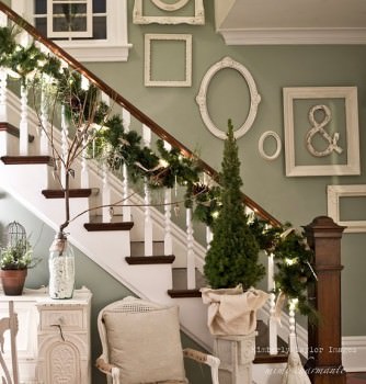
I also have a lot of frames that look like this. I like the interesting ornate bits about them, but I'm really hating the golden and brassy looking plastic. It's dated and not in a cool way. I've had thoughts of maybe spray painting them all one colour and then creating a grouping with them. What do you think? I'm leaning towards all black but white would look good, too. Here's an example of an all white photo frame collection just to get an idea of what it could look like.
Maybe I'll just rotate stuff around the house for a while, propping frames up on walls here and there until I like it enough to nail it in. I think the problem with a lot of the pictures is that I remember where they went in the old house and I can't really get past that thought. If it was in the dining room, I want it to go back in the dining room, but then I find I don't like it in there anymore so then I feel lost and give up. The trials of making stuff work in a new location!


1 comment:
I love those antique looking frames! I like where you're going with spray painting them all one colour. You'll keep the traditional shape and make them look more modern with fresh paint. Grouping them is also an awesome idea, but you knew I was going to say that.
Post a Comment